Kyle Starsinic
"A Caterpillar in the Circuit"
or
"Beyond the Thicket"
(working titles)
Overarching plot:
An electrician goes on a journey across worlds to find a bug in the circuit, getting entangled in sinister conflicts, theological conspiracies, and political turmoil along the way.
Part One of Four:
A mild-mannered and slightly anxious electrician goes on a journey to find a bug in the circuit, but the moment he steps out of his comfort zone, he's hit by a train. Within an inch of death, he's brought back to life by his scientist dad and imbued with electrified blood, and they team up with a dim-witted headhunter and a lovestruck knight to save a princess from her oppressive dad and an evil bishop.


THEIR OWN FACES
An Art Show - July 12, 2025


The more I stare at the faces I know, the less I see the person — and the more I see the form.
You think you know your friends’ faces — until you really study them.

The human face
is architectural.
It is organic, yes, but at the same time, geometric.
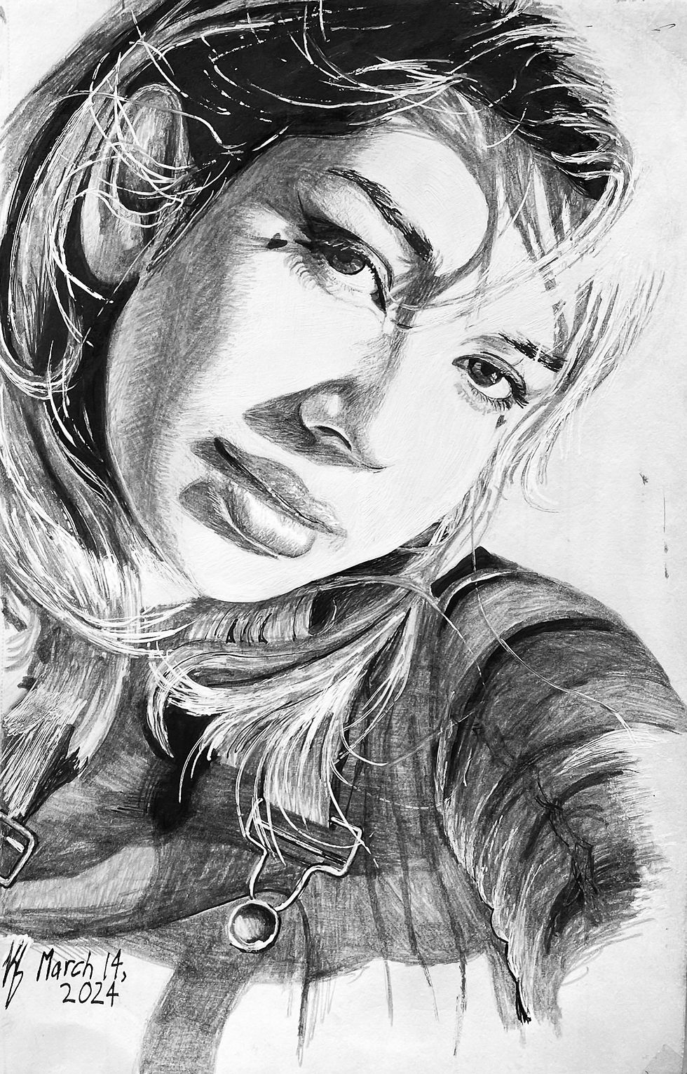
When I break it down into triangles and circles...

I find, every face shares the same structure. Much like a building.
Yet, they warp and stretch according to the person inside.
Our faces are geometric and structured, but decorated by personality.

Many of the subjects of my drawings attended the reception. It was everything I had hoped for and more.

Each person was chosen with intention. Though I’ve completed my 100, I feel there are still a few more to come.


"Hey, that's you!"
On July 12th, 2025, I hosted my gallery called "THEIR OWN FACES" at Cafe Social Club NYC.


GALLERY
SHOW


"Fisheye"
Acrylic on Canvas
2021-2025


FINE ART
"Scooter and Denver"
Acrylic on Canvas
2022
"Mannequin Wearing the Attire of the Leads of a Fairy Tale Stageplay"
Acrylic on Canvas
2025

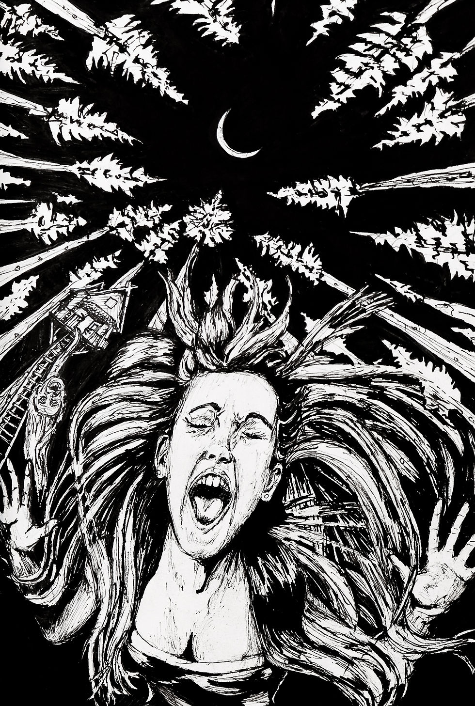
A connection from college, now working with Wiz Khalifa, asked me to pitch poster concepts for Wiz’s upcoming summer tour with Sean Paul.

Bring Your Lungs
Leaning into Wiz Khalifa’s well-known cannabis culture, I pulled visual inspiration from Fear and Loathing in Las Vegas and the surreal energy of Miles Davis’s Bitches Brew album art. The result was bold, experimental, and intentionally a little unhinged — a reflection of my approach: I chase the ideas others might hesitate to try and figure out how to make them work.

POSTER DESIGN

In the end, my design wasn’t the one selected — but it’s still a piece I’m proud of. It represents imagination over convention, risk over safety, and shows that I don’t just follow the brief — I bring something unexpected to the table.

The Trip


The Sale

The first deadline was intense — an overnight turnaround — and my initial design reflected that urgency. But when I was given a few extra days, I scrapped the first attempt and recalibrated entirely.


Crypt




ILLUSTRATION


Case Study:
EmOcean — Where Connection Finds Depth
Overview
EmOcean is a dating app inspired by the ocean — vast, alive, and full of potential connections. Instead of reducing romance to right-swipes and mutual match gates, EmOcean opens the waters. It blends the openness of social media with the intentionality of dating, so users can explore, engage, and connect — not just wait and hope.
The Problem
Modern dating apps promise abundance — “plenty of fish” — but deliver fatigue. Users swipe through endless profiles, hoping for matches that rarely spark. The experience often feels like:
-
Isolated browsing: You never know who’s seeing you.
-
Algorithm gatekeeping: Discovery is limited, not organic.
-
Passive interaction: Conversation starts only if you both swipe right.
Result
Superficial engagement, low-quality matches, and dating burnout.
Our Insight
What if dating felt less like gambling and more like floating — observing, reaching, and responding? Like social media, where connection is layered, informal, and ongoing? People want to see what’s out there — and decide how to connect, not just whether to match.
The Concept
EmOcean turns the dating app inside out — from match-first to explore-first. The sea is open, full of emotion and motion. Instead of swiping through faceless queues, users enter a dynamic ecosystem of people sharing who they are in small, expressive ways.
Design Direction
-
Visual Identity: Fluid, layered interfaces — soft blues, gradients, and light transparency. Depth and motion echo the ocean metaphor.
-
Typography: Gentle, modern serif-sans hybrid — romantic but clear.
-
Tone of Voice: Calm, inviting, introspective. Less “What’s your type?” and more “What’s your vibe?”
Results & Reflection
EmOcean invites users to slow down, look around, and connect with intention. It transforms dating from a transactional swipe game into a richer, more emotional experience. Early user feedback showed:
-
Increased time spent browsing others' content (not just profiles).
-
Higher rate of message initiations via reactions.
-
Lower drop-off after first conversation.
In EmOcean, people don’t just search for matches — they explore humanity.
UX DESIGN


